What's new
What's new

how much of the raised lettering should I highlight?

metalmagpie

Titanium
Joined
May 22, 2006
Location
Seattle
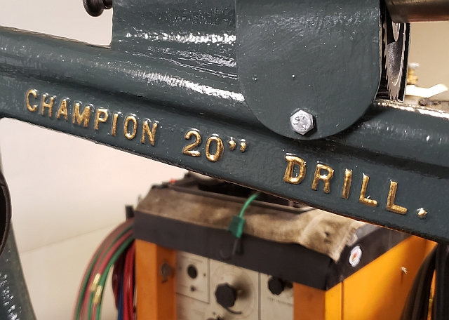
I've done a dozen or so machines which have raised cast iron lettering.
Example "FAMCO 3-1/2C" When I was younger, I would invariably highlight all raised lettering, often with gold leaf (I got a bottle of gold leaf paint once). As I've
gotten older I have soured somewhat on the process, however. This time, though, my daughter is living with me and she is a very talented painter. So I'm looking for opinions - just the manufacturer and perhaps model number? Every casting number? None? Or somewhere in between.

If you have an opinion please let's hear it.

Thank you,

metalmagpie
 
I'm not the best painter however I vote for the raised lettering being painted. Especially if it is prominent and also being used. View attachment 332078 here is a sample of my lathe. Also makes reading the numbers a little easier.

Harold

Nice machine, Harold! I completely agree that lettering like FAST MED SLOW or the various gear speeds should be highlighted for ease of reading. I'm thinking more of something like
MADE IN GROTON MA which imparts no useful information to the operator.
 
In general I'm for highlighting raised letters. Exception for me maybe gray color machines. Red, white, or black lettering just does not tickle my fancy on a gray machine.

Some other colors though:

17.jpg 185.jpg 186.jpg 26.jpg
 
...., I would invariably highlight all raised lettering, often with gold leaf (I got a bottle of gold leaf paint once). As I've
gotten older I have soured somewhat on the process, however.
metalmagpie
And why is that?
Is there any limit to detailing things that one likes?
Tiny things right up there with the question.
Some would say just paint it all blue and that for sure works.
Extra effort and time is there a payoff one way or the other.
Bob
 
I'd leave the casting numbers alone. The MFG's name, control labels, etc I always paint to contrast.

Sent from my SAMSUNG-SM-G891A using Tapatalk
 
I have been known to use a paint pen to highlight lettering/nameplates. Easy to remove [lacquer] if I tremble and covers well especially silver.
 
Just manufacturer's name and model - Don't do the casting #'s, that looks tacky .
And consider just painting / highlighting the upper parts of the raised letters, rather than painting all the way to the base of the lettering - Sometimes a lighter touch on this looks better, depending on the machine.
 
I had a girlfriend that did Von Dutch style pinstriping
on my DoAll bandsaw. It looks super cool. She was into
hot rods and 50s type stuff. I miss her.

--D
 
Do you have access to pics of these presses in original condition? If so, I would let the appearance of the raised letters be your guide. I see a restoration job not as a fix-it-up project but as an effort at recreating the appearance and personality of the original machine. That goes for the choice of highlighting color as well. Personally, gold leaf, if it was not used on the original, strikes me as an immediate indicator of what may be little more than just another repaint job. Depends of course on what you are trying to achieve. My guess based on other jobs you have done, is that you have done an excellent job with the Famco. Pics as suggested in post #3 would be good.

-Marty-
 
I had a girlfriend that did Von Dutch style pinstriping
on my DoAll bandsaw. It looks super cool. She was into
hot rods and 50s type stuff. I miss her.
--D

You let her get AWAY?? You fool.

This machine originally had gold leaf on the background, was pretty worn away. I used gold paint and then highlighted the lettering in black. I think this is the original scheme.

pw_lathe_vfd_3.jpg
 
I've never seen an original paint scheme that had painted casting numbers, just manufacturers information and control information. You want the machine to look nice, but the lettering is practical too in that having the mfg. info highlighted is advertising, and control info is for ease of use. Painted casting numbers don't really serve a purpose.
 
For what it's worth, metallic Sharpie actually does a pretty good job highlighting raised lettering. I used it on a bench vise that I restored probably 6 years ago and it's still holding up fine. Wont hold up to solvent at all, though (obv.)

Sent from my SAMSUNG-SM-G891A using Tapatalk


Back
Top